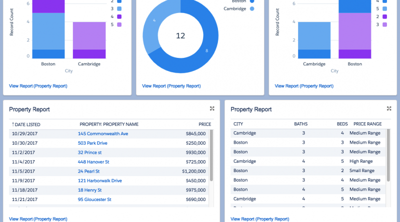
Complex Report – Simple Dashboard
Sometimes the most important thing is a dashboard to present to users – this can covey all the detail that a report does but in a simpler and more consistent way.
The example below uses the ‘Dreamhouse Lightning’ Salesforce setup – see github
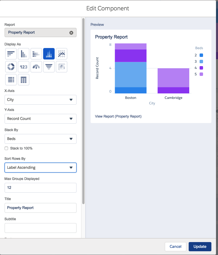
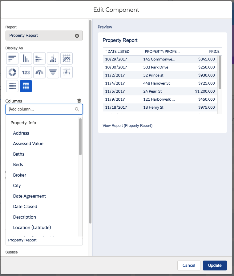
Below we have a simple dashboard with a few graphs and also a table of results and finally a counter of number of properties.
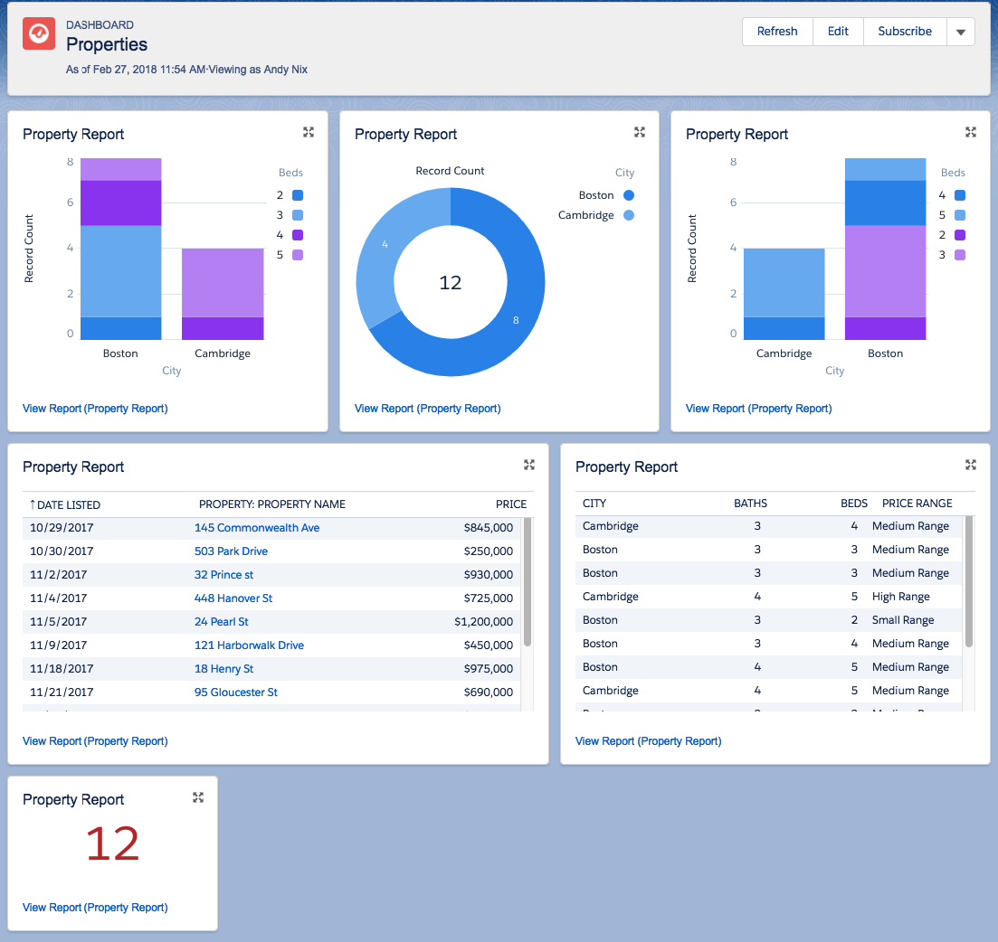
Behind the scenes there could be 6 different reports, but if you up the complexity of the report then you can actually make it stretch and do multiple dashboard views of the same data.
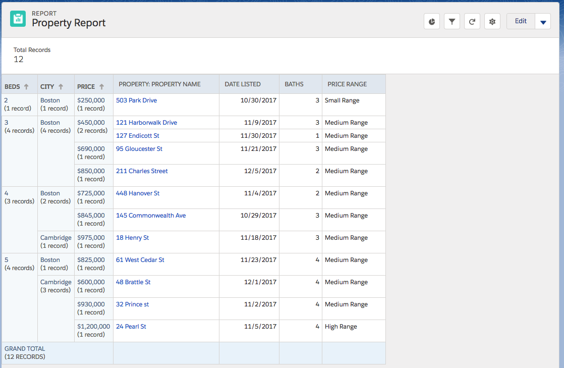
Below is the report that powers the dashboard.
and the report design
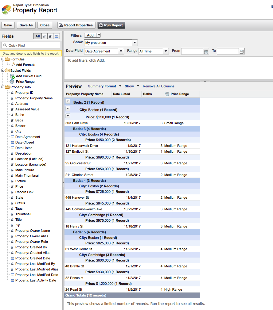
The important item thing is to set the report type to ‘Summary Format’ and then to group records. This allows the dashboard to use the group headings (Beds, City, Price) in the components displayed in the dashboard.
At the time of writing this, there are only 3 levels of grouping – so choose carefully.
Also added is bucket :
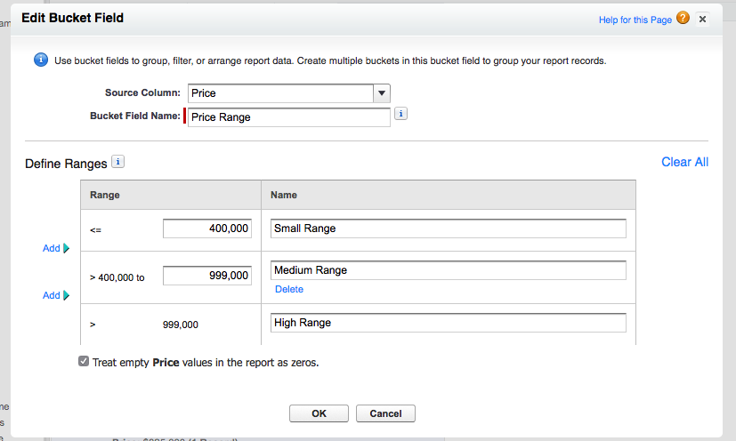
There are some annoying restrictions:
- The bucket items cannot be used as say totals in graphs
- Things like average price are not available
One added bonus is that the table report can access all the fields in the object not just those in the report.
So for a simple,manageable dashboard create a complex report.

