Enhancing DataTables in LWC – Part 2 Checkboxes
This post builds on part 1 and looks at the checkbox and how this can be available on some rows and not others.
This is going to be a lot of work, just to remove a few checkboxes. We will create our own datatable and take control of the formatting of the first column and add in the checkbox as we need it on certain rows, but we also need the functionality via an event of the checkbox !!
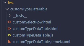
Lets create a customTypeDataTable component and then use this in a parent component. Create a lwc as normal but we will also need an additional file in the same folder structure so:

Our customDataTable.html is a blank template:
<template>

</template>
Our javascript is extending the LightningDatatable into our CustomTypeDataTable lwc and we define a customType called customSelect which is based on the imported template customSelectRowTemplate which references our html file in the same folder. We can use the typeAttributes to bring data into the cell to then be used :
import LightningDatatable from "lightning/datatable";
import customSelectRowTemplate from "./customSelectRow.html";

export default class CustomTypeDataTable extends LightningDatatable {
  static customTypes = {
    customSelect: {
      template: customSelectRowTemplate,
      standardCellLayout: true,
      typeAttributes: ["disabledItem", "checkedItem", "id"]
    }
  };
}
Our customSelectRow.html is a simple checkbox:
<template>
  <c-custom-select-row
    disabled-item={typeAttributes.disabledItem}
    checked-item={typeAttributes.checkedItem}
    record-id={typeAttributes.id}
  ></c-custom-select-row>
</template>
The template is referencing a new lwc that will do the display and events of the cell. We are passing to this component the data from the table via the typeAttributes object.
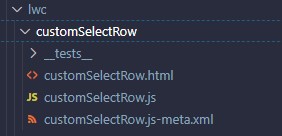
So we need a new lwc called customerSelectRow:

As this has both the html and js file we have it a separate component. The html shows the lightning input as a type checkbox, but only if the item is not a disabledItem and we also show it ticked if the checkedItem is true. There is an onchange handler that will send our event.
<template>
  <template if:false={disabledItem}>
    <lightning-input
      type="checkbox"
      label="checkbox"
      variant="label-hidden"
      name="checkbox"
      onchange={handleCheckBoxSelected}
      checked={checkedItem}
      class="checkbox"
    >
    </lightning-input>
  </template>
</template>
The javascript file holds our attributes (it gets the values from the custom table) and sends an event to the parent when a checkbox is checked – passing in the recordId and then also if checked or not :
export default class customSelectRow extends LightningElement {
  @api disabledItem;
  @api checkedItem;
  @api recordId;

  handleCheckBoxSelected(event) {
    console.log("onCheckBoxSelected");
    const customEvent = new CustomEvent("customselectrowclicked", {
      composed: true,
      bubbles: true,
      cancelable: true,
      detail: {
        recordId: this.recordId,
        checked: event.target.checked
      }
    });
    this.dispatchEvent(customEvent);
  }
}
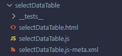
all that remains is to use the custom datatable in an easy example

<template>
  <c-custom-type-data-table
    data={data}
    columns={columns}
    key-field="item"
    hide-checkbox-column
    oncustomselectrowclicked={handleCustomSelectRowClicked}
  >
  </c-custom-type-data-table>
</template>
The javascript code is below. We create some sample data, then build the columns of the table, with our first column being a customSelect type (so a custom type) and then we are getting the data and passing across to the to cell with the typeAttributes. On the connectedCallback we run through the data with a map to add the extra fields to set if the check box is displayed or not and then if the checkbox defaults to selected:
import { LightningElement } from "lwc";

const sampleData = [
  { id: "1", itemName: "item A", category: "Test", status: "Pending" },
  { id: "2", itemName: "item B", category: "Test", status: "Rejected" },
  { id: "3", itemName: "item C", category: "Test", status: "Pending" }
];

const columns = [
  {
    label: "Select",
    type: "customSelect",
    typeAttributes: {
      id: { fieldName: "id" },
      disabledItem: { fieldName: "disabledItem" },
      checkedItem: { fieldName: "checkedItem" }
    }
  },
  {
    label: "Item",
    fieldName: "itemName"
  },
  {
    label: "Category",
    fieldName: "category"
  },
  {
    label: "Status",
    fieldName: "status"
  }
];

export default class SelectDataTable extends LightningElement {
  data;
  columns = columns;

  connectedCallback() {

    var modifiedData = sampleData.map((item) => {
      return {
        ...item,
        disabledItem: item.status == "Rejected",
        checkedItem: item.itemName == "item A"
      };
    });

    this.data = modifiedData;
  }

  handleCustomSelectRowClicked(event) {
    console.log("handleCustomSelectRowClicked");
    console.log(event.detail);
  }
}